by Da'ud ibn Auda, al-Jamal Herald
This paper is not intended to be, and indeed, given the time and space constraints cannot be, anything like an exhaustive study on period style in armory. What it is intended to do, however, is to give the herald in the SCA a foundation of some of the principles underlying period style and how those principles have been written into the Rules for Submissions, which then may become a guide to encouraging period-style armory.
Introduction
"Originally the art of heraldry was nothing more than a symbolic language expressed by deliberate conventions of design. It was necessary to recognize the symbols and colours at a distance, so shapes were simplified and exaggerated. This was not pictorial art but graphic communication."1
This is the heraldry that the SCA attempts to emulate, what has been termed "period style". In fact, the Rules for Submission of the College of Arms of the SCA require that all armory registered in the Society be "period" in "style". But what exactly does "period style" mean?
Synonyms for "period" are "age", "era", "time", and "epoch". Synonyms for "style" are "form", "manner", "mode", "fashion", and "vogue", and as a verb, to "arrange", to "design", and to "fashion". So "period style" is the "mode" or "fashion", the "arrangement" or "design" of a particular "time". When heralds in the SCA speak of "period style", they are referring specifically to the manner in which armory was designed within the period of the SCA's period of study -- pre-Seventeenth Century western Europe -- or, even more specifically, heraldic design as used from the earliest days of heraldry circa 1150 A.D. to the Battle of Bosworth Field in 1485. (Why 1485 and not 1600? Because as non-SCA heraldic writers inform us, the establishment of the Tudors on the throne of England led to a change in the way coats of arms were being designed; they became much more complicated, busy, and unbalanced. The ideals of period style we try to achieve in the SCA with our armory hearken back to the days of simpler design.)
1 Heraldry for Embroiderers, Vicky Lugg and John Willcocks, B.T. Batsford, Ltd., London, 1990, p. 48.
The Philosophic Basis of Period Heraldic Style
"On the battlefield a man wanted a device that would say 'so-and-so is here!' - not one that said 'I'm a picture of x...'" (Hilary of Serendip, "The Philosophical Roots of Heraldic Design", Outlands Herald's Handbook, April 1992, p. 66)
 "The philosophical roots of heraldry are found in some of the most deeply-felt beliefs of medieval life. First is the concept that the proper order of the world is fixed and static. God's in His Heaven, the King rules on earth. Duty and obligation flow up and down in a great chain from the lowest to the highest, and one's place is one's proper place. If you are noble, you should bear arms, and it is natural that your arms should reflect this feeling of balance and partake of this harmony. Since they will be passed down to your heirs forever, they will be fixed, just as the proper place of your house is fixed in the chain of duty and obligation. Arms which imply change and movement as a part of their design are not going to be attractive to you as a person born in a heraldic culture, nor would such arms be designed for you by the heralds. You probably wouldn't think about it consciously, any more than we think about the philosophical basis behind modern trademarks, but that basis will show in the design of the arms, just as the modern philosophy of change shows in modern trademarks. (Think of all the corporate logos that suggest movement.)" (Frederick of Holland/Eilis O'Boirne)
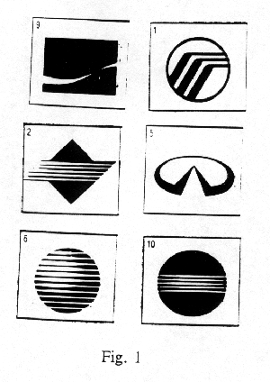
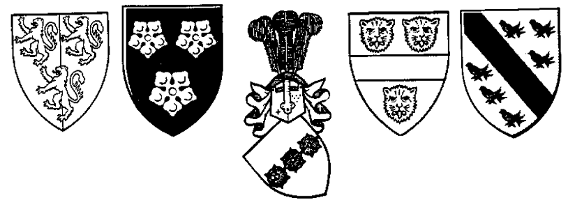
 Consider, for example, the following trademarks to the right: Coca-Cola [Fig. 1, No. 9]. Mercury [Fig. 1, No. 1]. Sprint [Fig. 1, No. 2]. Infiniti [Fig. 1, No. 5]. AT&T [Fig. 1, No. 6]. Minolta Camera [Fig. 1, No. 10]. All of these attempt to show movement in one direction or another. You can probably think of other trademarks that do, too.
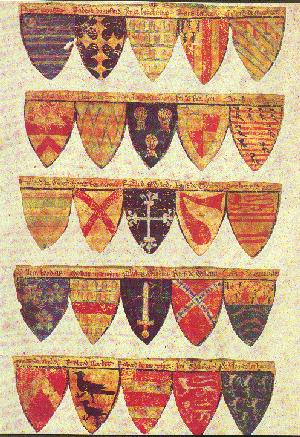
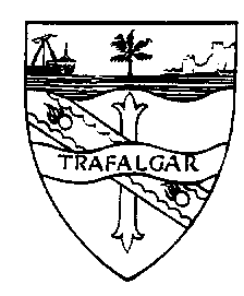
 So, all that being said, where do you go to find what "period style" really is? To find out what "period style" armory looks like? The best source, of course, are primary sources: period rolls of arms, with the arms painted right there before you, as in the figure to the left. Of course, not many of us have access to period rolls of arms, or even to books reproducing them.
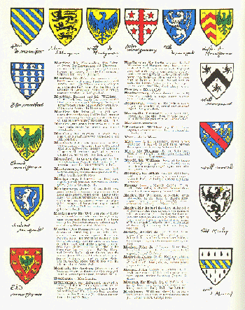
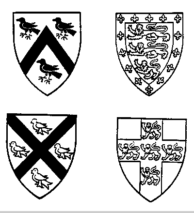
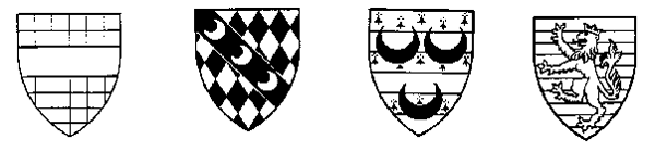
The second best sources are (naturally enough) secondary sources, books like Joseph Foster's The Dictionary of Heraldry (right), which contain modern drawings of arms from period rolls. This still puts the pictures right in front of you, and with adequate time to look through them, you can get an adequate "feel" for what period style looks like.
Another, and frequently overlooked, source is the Rules for Submissions of the SCA College of Arms. The Rules were designed to not only encourage, but as much as was thought reasonable, to require armory to be period in style. As a consequence, "period style" was purposefully designed and built into the Rules for Submissions. During the remainder of this discussion, we will be quoting extensively from the style sections of the Rules in our discussion of the elements of period style.
Elements of Period Style
Simplicity
"Armorial Simplicity - All armory must be simple in design." (RfS VIII.1.)"Tincture and Charge Limit - Armory must use a limited number of tinctures and types of charges."
As the number of tinctures involved in a device increases, the number of types of charge[s] should decrease. As the number of types increases, the number of tinctures should decrease. In no case should the number of different tinctures or types of charges be so great as to eliminate the visual impact of any single design element. As a rule of thumb, the total of the number of tinctures plus the number of types of charges in a design should not exceed eight. As another guideline, three or more types of charges should not be used in the same group." (RfS VIII.1.a.)
These two quotes should be pretty much self-explanatory. And the underlying principle is pretty much that same underlying principle of human life in general: KISS (Keep It Simple, Stupid). "The reason for this is the raison d'être of heraldry: instant identification." (Bruce Draconarius of Mistholme, Cover Letter to the September 1993 LoAR). The more types of charge on the shield, the greater the number of tinctures, the more visually "busy" and therefore less instantly identifiable the entire design. "This is overly complex for period style, involving as it does five tinctures and four different types of charge. If would add a considerable amount of unity to the design if the [major charges] were both of the same tincture." (Alisoun MacCoul of Elphane, LoAR 28 December 1986, p. 16).
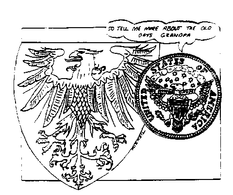
 An example of how the complexity of adding more types of charge can reduce the impact of a design element can be found, a cartoon depicting the more modern, complex arms of the United States (whose primary charge is an eagle displayed) asking the period style, simpler uncharged eagle displayed about what it was like in "the old days". Notice how the visual impact of the eagle is reduced in the modern version because of all the "frou-frou" which has been added to it.
For the same reason, identifiability, period-style armory uses groups of identical charges. (There may be more than one group of charges on the shield, and the charges making up these various groups may be quite different, but generally the charges in each group will be identical.) "When the eye first sees a design such as, say, Sable, two lions and a Bengal tiger Or, it will be fooled for a moment into seeing three lions, or three tigers. There'll be a moment of confusion until the eye sorts out the almost-but-not-quite-identical charges ... and that confusion is exactly what we try to avoid." (Bruce Draconarius of Mistholme, Cover Letter to the September 1993 LoAR). Regarding a heart between three identical charges in chief and a different charge in base, itself charged with another heart: "This submission pushes hard at the limits of period style: ... [it] would be much improved if the heart were metallic with no superimposed colour and all the secondary charges were of one type." (Alisoun MacCoul of Elphane, LoAR 19 March 1988, p. 5) "The use of the two different ... variations [of a charge] on the chief is very poor style." (Alisoun MacCoul of Elphane, LoAR 24 December 1988, p. 1)
Balance
"Armorial Balance - Armory must arrange all elements coherently in a balanced design."Period armory usually places the primary elements of the design in a static arrangement, such as a single charge in the center of the field or three identical charges on an escutcheon. More complex designs frequently include a central focal point around which other charges are placed, like a chevron between [identical] three charges, but the design remains static and balanced. Designs that are unbalanced, or that create an impression of motion, are not compatible with period style." (RfS VIII.1.b.)
"What is medieval symmetry and balance? It is: One charge on the field. [As the shields to the right.] A standardized symmetric distribution of several of one kind of charge on the field, with the symmetry being usually around a vertical or horizontal line, but occasionally along a diagonal. Symmetric distribution of a standard number of a single charge around one other charge selected from a limited set, usually an ordinary." (Frederick of Holland/Eilis O'Boirne)
Regarding "on a pale surmounted by a bend embattled on the upper edge counterchanged, a beast's head and an anvil": "The overall design [is] just too complex and unbalanced for period style. The difficulties which were encountered ... in creating a blazon which would guarantee that the `staircase' would never overlie the charges on the pale was indicative of the problem. The counterchanging and the diminished size of the bend required by the [beast's] head above it on the pale decreased the immediate recognizability of the bend. Additionally, while the number of layers involved here can be reduced to three by reblazoning, the overall effects is visually complex and overly confusing, creating an effect of motion as the eye follows the `staircase' from top to bottom rather than processing the charges in a normal static manner." (Alisoun MacCoul of Elphane, LoAR 21 January 1990, pp. 20-21)
Mirror symmetry is modern, not period, style. "Note that medieval and modern symmetry are two different things. To the medieval mind, Gules three lions rampant Or was inherently more symmetrical than Gules, two lions combattant and in base another sejant affrontee Or. To the modern mind, the latter is more symmetric, more balanced, because the mirroring across the center of the shield is exact. To the medieval eye, the three lions are each in different positions, and are therefore three different charges. The three lions in the first device are all in the same position, therefore identical charges, therefore more symmetric. Extreme symmetry in a device, especially when the charges used are inherently asymmetric, tends to give a modern rather than medieval appearance to arms." (Frederick of Holland/Eilis O'Boirne)
Radial symmetry, where charges are "rotated" around a point on the field, is mostly modern style. There are a few very simple German arms from period which had three charges "in pall, points to center", but these are an exception to the general rule that in period, charges were oriented in the same direction.
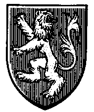 Charges in period were "static" as opposed to "dynamic". "The best period style [heraldry] clearly was static and balanced." (Alisoun MacCoul of Elphane, LoAR 26 February 1989, p. 20). We have discussed this above, where examples were noted of modern trademarks showing movement. This apparent movement makes the charges dynamic. Just as the little lines around a cartoon character's head or body can show movement, there are ways of denoting dynamism on otherwise static elements of an heraldic device. But this dynamism is a modern, not a period, concept. Period armory was static. "How, you ask, can a lion rampant be static? Just look at one!!! Yes, he is rearing up on his hind legs, his mouth is open, his front paw are spread to show the claws, - but he is balanced. See how the tail fills half the shield for a counterweight? That lion can remain in position forever, if necessary. All the details show that he is LION, they enhance his ferocity and his identifiability, but all they are doing is making the identity of the charge firmly `lion'. Look at how he stands. He is not about to leap out of the shield, or even off its edge. He is standing there firmly and is not about to change. He will remain `lion rampant' as long as he remains anything. Compare this to a modern drawing of a lion springing. He's going to be in another position in an instant. Then he's going to eat and sleep and hunt - and die. A medieval lion, a proper symbolic medieval lion, with the force of God and the backing of a sure knowledge of his place in the great order of things, will not change or die. He will last forever." (Frederick of Holland/Eilis O'Boirne)
Contrast
"Armorial Contrast - All armory must have sufficient contrast to allow each element of the design to be clearly identifiable at a distance". (RfS VIII.2.)
At its simplest, this "Rule of Contrast" is frequently described as "No color on color, no metal on metal". The modern-day counterpart of this rule is found on every street corner and highway in the country. For example, stop signs are argent (a metal) on gules (a color). This gives a greater contrast and allows for easier visibility (and identifiability). What if stop signs had black letters on red? Green on red? Blue on green? How easy would it be to read at dusk? At dawn? At night? Under oblique light? A lot more difficult to discern, don't you think?
Now, consider all the other traffic signs you see every day. Black on yellow; white on green; black on white; white on brown; black on fluorescent orange; red on white. In every case, there is good contrast, with a "color" on a "metal" or a "metal" on a "color".
How about another area where visibility and rapid recognition are important: automobile license plates? Same thing. Well, there was one occasion in the 1960's when the State of Michigan went to license plates that had white lettering on a gold ground ("metal on metal"). Normally, Michigan changed license plate colors only every several years, but after massive protests from nearly every police and law enforcement group in the State, they changed the very next opportunity to a higher contrast combination. Why? Because the license plates could not be read except under the most ideal of weather conditions. (And if you have ever been in Michigan, you know that ideal weather and lighting conditions are not so common as to create only an occasional problem.)
The same desire for ready recognition motivated the armorial Rule of Contrast. And so it is that you find, while looking through period rolls of arms, example after example of high contrast between charges and field.
Identifiability
"Armorial Identifiability - Elements must be used in a design so as to preserve their individual identifiability.
Identifiable elements may be rendered unidentifiable by significant reduction in size, marginal contrast, excessive counterchanging, voiding, or fimbriation, or by being obscured by other elements of the design. For instance, a complex line of partition could be difficult to recognize between two parts of the field that do not have good contrast if most of the line is also covered by charges. A complex divided field could obscure the identity of charges counterchanged. Voiding and fimbriation may only be used with simple geometric charges placed in the center of the design." (RfS VIII.3.)
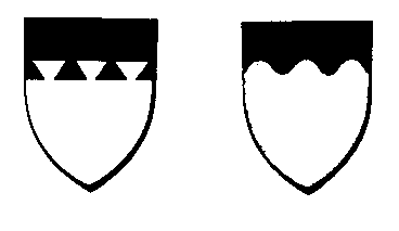 "Heraldry being a means of identification, its motifs should be drawn large, bold and visible." (Bruce Draconarius of Mistholme, Letter of Acceptances and Returns, 20 December 1992, p. 21) For example, lines of division should be drawn "big, bold and butch". As a good general rule of thumb, using the example of "embattled" here, though this will apply to any complex line of division, an embattled line of division running horizontally across the shield need have only three, or at the most four, embattlements.
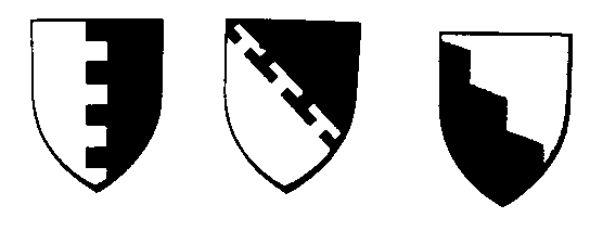 An embattled line of division running vertically or diagonally across the shield need have perhaps five embattlements. By reducing the number of embattlements, they can each be drawn larger, making them more easily and quickly identifiable. As another example, the distinction now found in many books on heraldry between "indented" vs. "dancetty" is a modern and not a period distinction.2 In period armory, "dancetty" referred to a two-sided ordinary (such as a fess or a pale) which zig-zagged or "danced" across the field, while "indented" referred to a line of division on the field or on a "one-sided" ordinary (such as a bordure or chief). The number of points, and the boldness with which they were drawn, was the same, unlike what modern (post-period) heraldic authors tell you about the two terms. A period-style indented line of division will not look as if it were cut with a pair of pinking shears!
Drawing style can sometimes make armory unidentifiable, too. As one example, the SCA doesn't allow unicornate horses (horses with a unicorn's horn), because such a charge blurs the line of identifiability between horses and unicorns. In spite of the way unicorns have been drawn by most artists in the last twenty or thirty years, they originally were considered relatives of the goat, and had a goat's beard and hooves, and a lion's tail. Unicorns were not drawn in art as looking like a horse with a horn growing from its forehead until the 20th Century. In heraldry, if you have to look at it for a while to tell whether it is a unicorn or a horse (to "identify" it), it is not drawn in a period style.
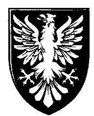
 In period armory, posture also was used to improve the identification of the type of charge: for example, eagles "displayed" ("spread-eagled", if you will) [left], falcons and most other birds "close" [right], owls "close guardant", lions "rampant". "Note that the unicorn's head cabossed is rather poor style; in this posture the distinguishing features of the unicorn's head are nearly unidentifiable." (Alisoun MacCoul of Elphane, LoAR 26 October 1986, p. 7). To return to our traffic sign analogy, many signs can be determined simply by their shape, and the shape of sign is a part of the identification process. In the United States, stop signs are always octagonal; yield signs are always triangular; railroad crossing signs are always an X or a round sign with an X on it. You can tell the difference between a U.S. Highway and an Interstate highway simply by the shape of the "shields" the specific numerical information is placed on. State highways, too, often have their own particular shape. The other informational and warning signs have specific shapes, which are a part of the identification process for the driver, who can determine without having to read every sign by the side of the road whether he or she needs or desires the information it contains.
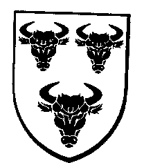 So, too, charges in period armory were generally drawn in their "most recognizable" aspect (e.g., bull's heads [left] were drawn facing the viewer, so their horns, as one of the most identifying characteristics, could be seen, rather than the more standard head position in profile); so often so that those postures became the default postures which no longer had to be specifically blazoned, and thus became part if the identifying characteristics of the charge(s). E.g., falcons weren't drawn as displayed, because if it was a raptor displayed, it was an eagle.
2 "As has been well established in the past by a considerable body of mundane scholarly research, as well as by Society precedent, period usage appears to have reserved the term "dancetty" for ordinaries rather than lines of division: the distinction between `dancetty' and `indented' when applied to ordinaries being not one of amplitude, ... but a distinction parallel to that between counterembattled and bretessed." (Alisoun MacCoul of Elphane, LoAR 24 December 1988, p. 10)
Depth
"Perspective - Charges may only be drawn in perspective if they were so depicted in period armory.This statement should be pretty much self-explanatory.
A pair of dice may be drawn in perspective since they were routinely drawn that way in period armory to show the pips. A bear, dolphin, or castle should not be drawn in three dimensions, but should appear only in its standard, flat heraldic form." (RfS VIII.1.c.i.)
Layer limit
"Layer Limit - Designs may not be excessively layered.
All charges should be placed either directly on the field or entirely on other charges that lie on the field." (RfS VIII.1.c.ii.)
This also goes back to the underlying principle of simplicity. More than three "layers" (field, charges, charges on charges), and being able to quickly identify what exactly is going on the shield can start to become problematical. In the figure of Nelson’s arms to the left, for example, the charge at the "bottom of the heap" is actually a cross.
Conclusion
To sum up, then period style tends to follow the following general rules. (Yes, I know that examples can be found even from early heraldry which break every one of these general rules. Such frequently were royal arms, which being easily recognized because of familiarity, were able to "get away" with violating these general rules. These relatively rare exceptions do not, however, make the general rules here any less valid.)
Period style armory tended to have good contrast. No color on color. No metal on metal.
Period style armory tended to be quickly identifiable. [Some talk is given in the SCA to the "across the field" test. (If you look at a full size shield of someone's armory from across the list field, are they still identifiable?) Another test is what some call the "Five-Second Test". You are on the melee field. A very large fighter comes charging at you, shield and sword raised high. You have until he reaches you (five seconds, maybe) to determine if he is on your side or your opponent's. The only means of identifying him you have is the armory painted on his shield. Can you identify it? Period style armory tended to be that quickly identifiable.]
Complex lines of division were drawn big and bold.
Period armory used static charges, without any visual "cues" showing movement, arranged in a balanced, symmetrical arrangement.
 Charges were drawn to "fill" the space of the shield without overly crowding it. As a consequence, arrangements of charges around other charges were not specifically blazoned, but left to the artist's discretion, depending upon the shape of the shield. As a consequence, charges in base on a standard heater shape were sometimes drawn either larger or smaller than identical charges in chief, depending on the number of charges. The size of ordinaries tended to be somewhat flexible; they would widen if they were charged, or narrow if uncharged but surrounded with other charges.
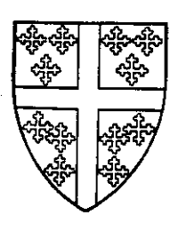
 Period armory tended to use groups of identical charges: one charge on the field. Two identical charges in pale. Three identical charges, two and one. Three identical charges on an ordinary (pale, fess, chevron, chief). Five identical charges on a cross. (The definition of "identical" in period style does not mean the same charge in different postures.)
Ermine furs and semy treatments tended to use a smaller number of larger "spots". Eight (or even six) charges on a bordure is a semy. On a primary charge, five or six is normally plenty. (E.g., a "cross ermine" would do well with five ermine spots; a "bend sinister goutty d'eau" would do well with five or six gouttes. I have seen a beast "charged" with three ermine spots blazoned as ermines (counter-ermine). In this way, the strewn charges can be drawn sufficiently large to be easily recognized.
While many period coats of arms use complex elements, as a general rule, they only used one complex element in each coat. If a coat had, for example, a checky field, there was a general tendency to charge the field with only a single, plain-edged ordinary. If a coat had, say, a barry lion or a checky eagle, it tended to be the only charge on a plain field; or if the field were barry or checky, a single charge or group of three identical charges tended to be the rule. If one element (either the field or a charge) had a complex line of division, all (other) charges on the coat used plain lines (e.g., in coat with a pale and bordure, either the pale or the bordure may have had a complex line of division, but not both.)
So, how does one learn to understand what period style in armory is? First and foremost, of course, by looking at period armory. And second, to borrow a phrase from "The Wizard of Arms", "Follow the Rules for Submissions".
Bedingfeld, Henry, and Peter Gwynn-Jones, Heraldry, Chartwell Books, Inc., Secaucus, NJ, 1993
Brault, Gerard J., Early Blazon, Oxford (Clarendon Press), 1972
Foster, Joseph, The Dictionary of Heraldry, Arch Cape Press, New York, 1989
Fox-Davies, Arthur Charles, Heraldry, A Pictorial Archive for Artists & Designers, sel. and arr. by Carol Belanger Grafton, Dover Publications, New York, 1991
Friar, Stephen, A Dictionary of Heraldry, Harmony Books, New York, 1987
Friar, Stephen, and John Ferguson, Basic Heraldry, W.W. Norton & Company, New York, 1993
Lugg, Vicky and John Willcocks, Heraldry for Embroiderers, B.T. Batsford, Ltd., London, 1990
Neubecker, Ottfried, Heraldry: Sources, Symbols and Meaning, Macdonald & Co (Publishers) Ltd., London, 1988
von Volborth, Carl-Alexander, Heraldry: Customs, Rules and Styles, New Orchard Editions, London, 1991
Woodcock, Thomas and John Martin Robinson, The Oxford Guide to Heraldry, Oxford University Press, Oxford, 1988
SCA Publications
The Rules for Submissions of the College of Arms of the Society for Creative Anachronism, Inc., privately published, 1990, 1994
Torric inn Bjorn, Heraldic Templates, privately published, Portland, OR, 1992
The Known World Handbook, 1985, updated 1992
-
Frederick of Holland and Eilis O'Boirne, "Heraldry in the SCA"
Hilary of Serendip, "The Philosophical Roots of Heraldic Design"
-
Frederick of Holland and Eilis O'Boirne, "Heraldry in the SCA"
Hilary of Serendip, "The Philosophical Roots of Heraldic Design"
Originally Webbed by Dafydd Wolfson / dafydd@dnaco.net